The Different Types of Fonts and When to Use Them
Choosing the right typeface is an important component of design or any brand identity. Typefaces can be grouped based on their traits and exist in a wide variety of sizes and shapes. Most font styles were affected by history, therefore fonts can be based on many historical periods. You can find the best style and font combinations for your upcoming project by categorizing fonts. Like having a wardrobe, building a decent font collection is similar. You must have access to a variety of font styles and be knowledgeable about how and when to use each.
In this article, we will be giving you an overview of the different types of font categories that have developed over time or commonly known as “Font Family.” You can choose the ideal font style for your upcoming project with the help of our hybrid list. You can get ideas from the font type examples that are provided for each category.
How to pick your font in a world with a million different types of fonts
In this day and age, typeface classification is much easier and faster. Thousands are offered to the public with many different typefaces. However, the choice and selection of the right fonts can be incredibly challenging. This blog aims to guide you through a selection of fonts that communicate what you are looking for and how they are used.
Types of Font (Font Families)
Serif Fonts
The little feet at the end of a letter’s stroke are known as serifs. These feet first appeared in the past, when type was created in a different way. Stone used to be chiseled to make characters. Each character’s endings were given short, square serifs by the chisel. There are subcategories that are called for their places of origin within the serif group.
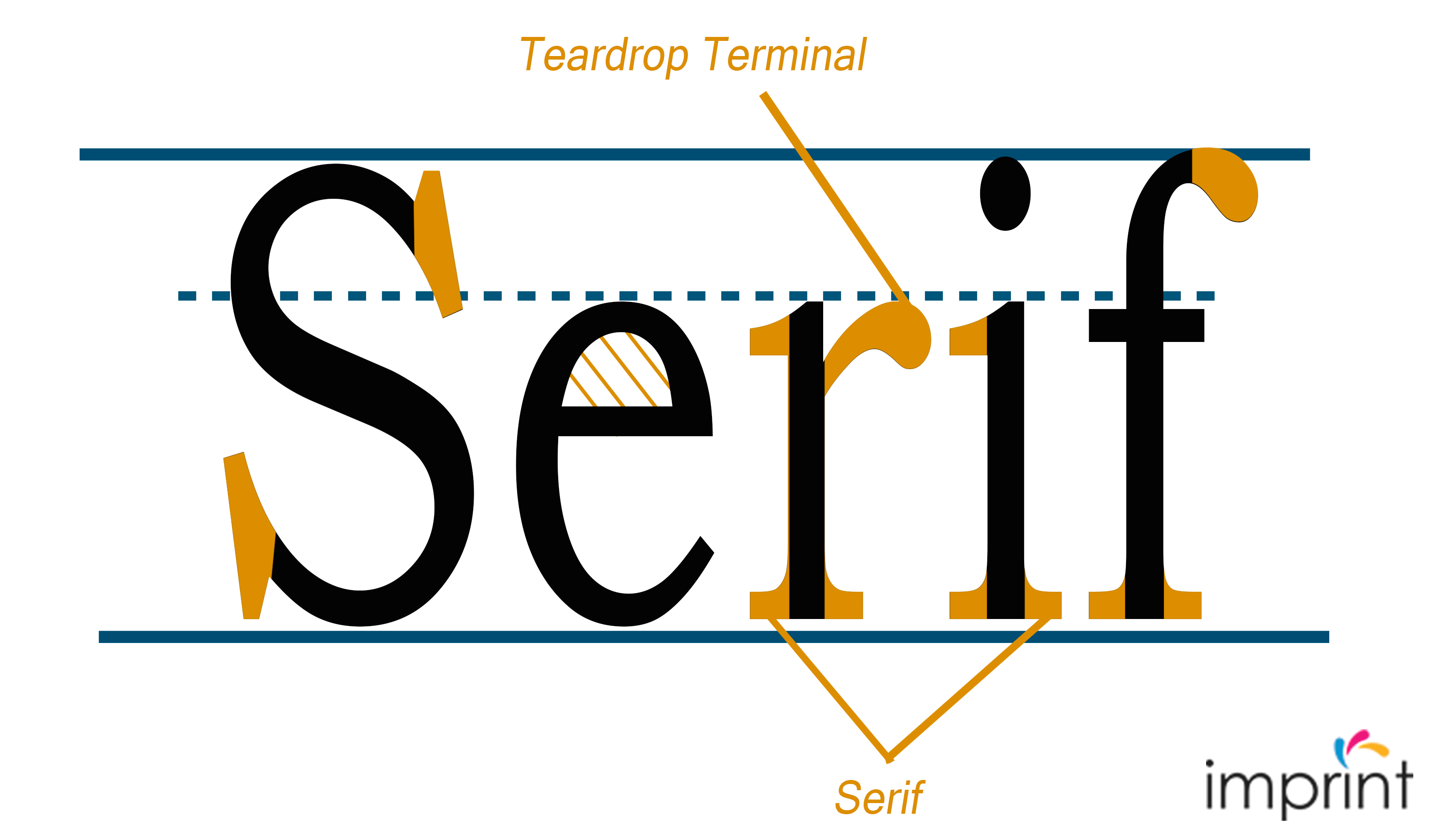
These serifs—aside from Slab Serifs—can be used in body copy. They are comfy for the reader’s eyes and simple to read. Let’s look at this:
Old Style Serif
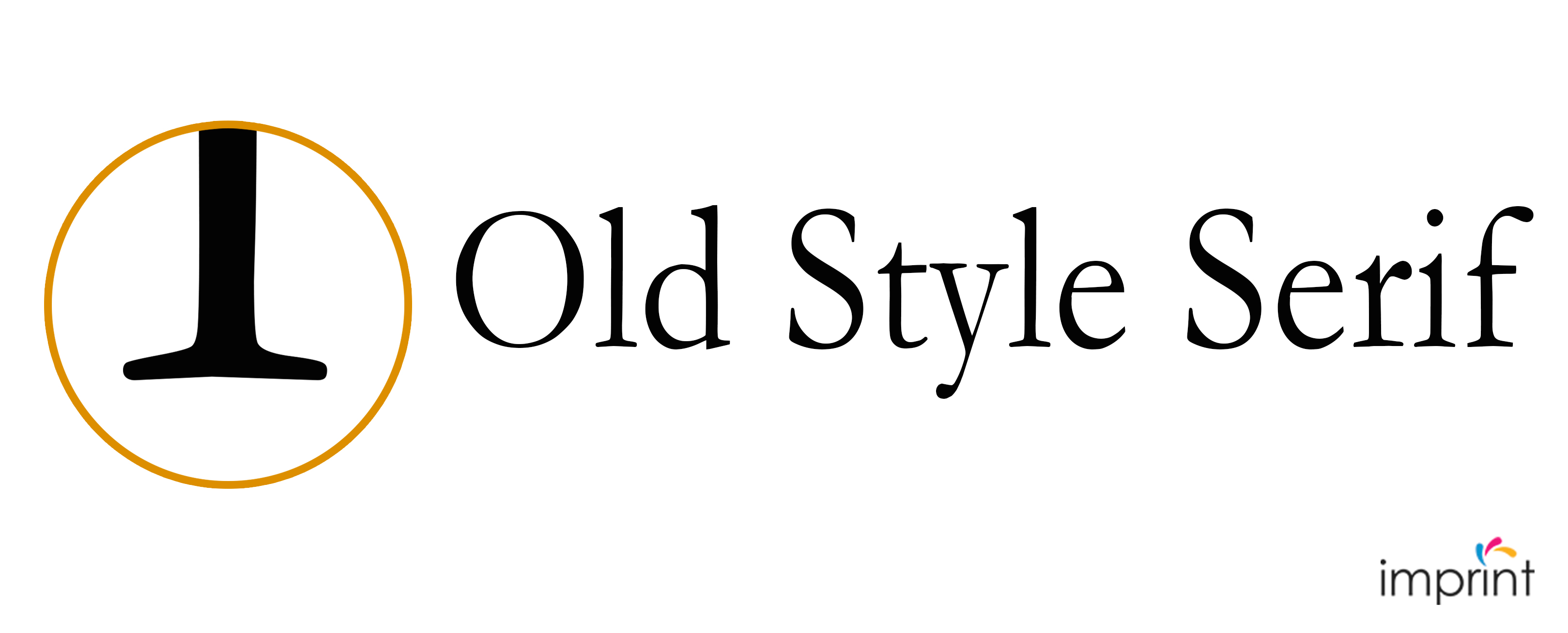
The 15th through the 18th century saw the development of the Old Style serif fonts style. The majority of these types were designed as metal type to use in early printing methods. Among the key characteristics are:
– To create a calligraphic effect, the characters are stressed diagonally rather than vertically.
– Letters with slightly slanted serifs are what define the Old Style form.
– The serif’s end can be either straight or rounded, with noticeable brackets.
– The letterform’s thick and thin strokes don’t stand out much from one another.
– Serifs can also be cupped or straight.
– The crossbar on the lowercase “e” is typically slanted; this feature was taken from the position of the writer’s pen.
In terms of height, the x-height on lowercase letterforms is taller than the cap height. The ascenders are a little taller than the cap.
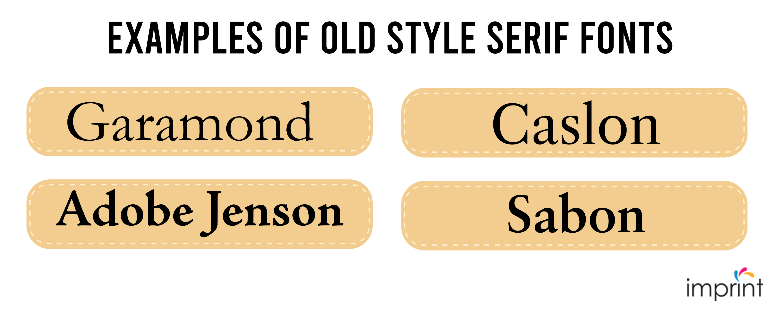
Garamond, Adobe Jenson, Caslon, and Sabon are examples of Old Style Serif fonts.
Transitional Serifs

Transitional font styles first appeared in the 18th century. It was a transition era between Old Style and Modern letterforms, as the name implies. The printing method was enhanced, allowing for more delicate details. Let’s have a look at the main features:
– During this time, serifs were sharper and had smaller brackets—almost flat.
– Transitional typefaces feature virtually, if not entirely, vertical stress when compared to Old Style characters.
– The contrast between thick and thin strokes is significantly more pronounced.
– Transitional fonts have a lower serif inclination and flatter ascenders.
In comparison to the cap height shown in the Old Style, this style kept the tall x-height and ascenders height.
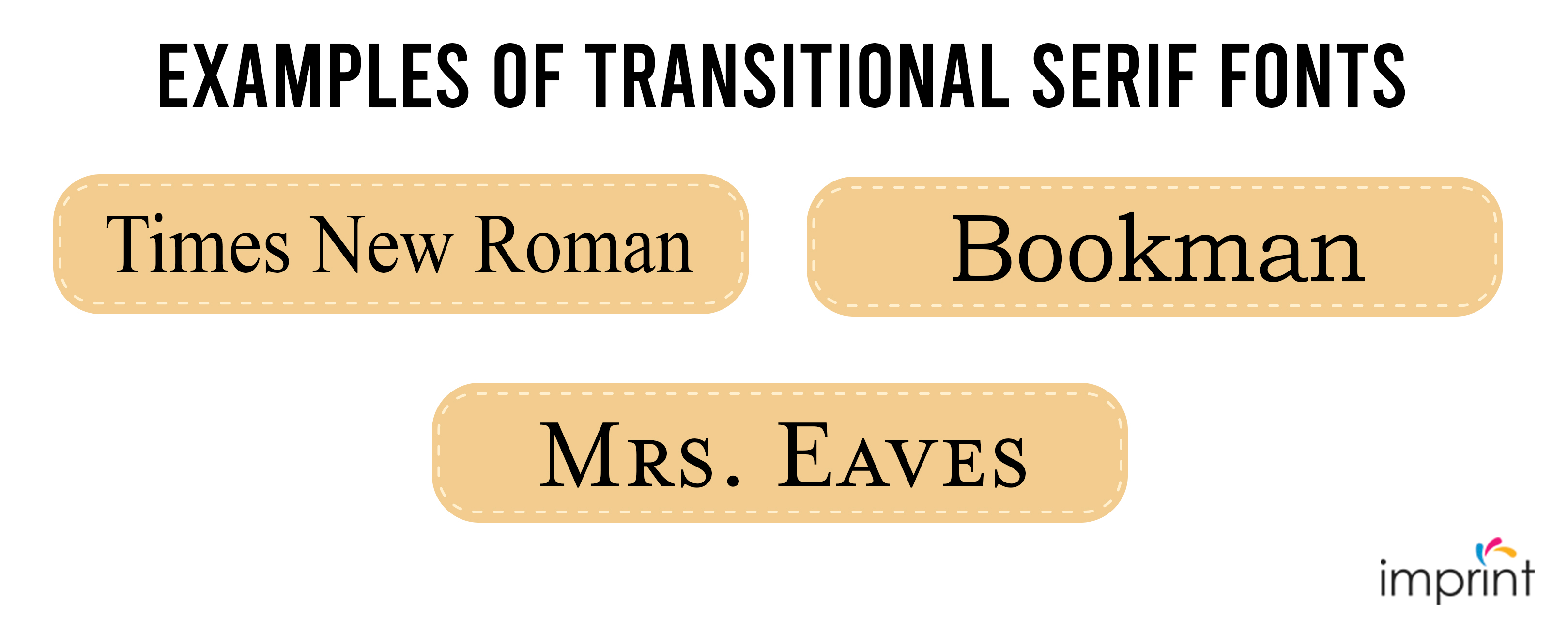
Times New Roman, Bookman, and Mrs. Eaves are examples of Transitional Serif fonts.
Modern serifs
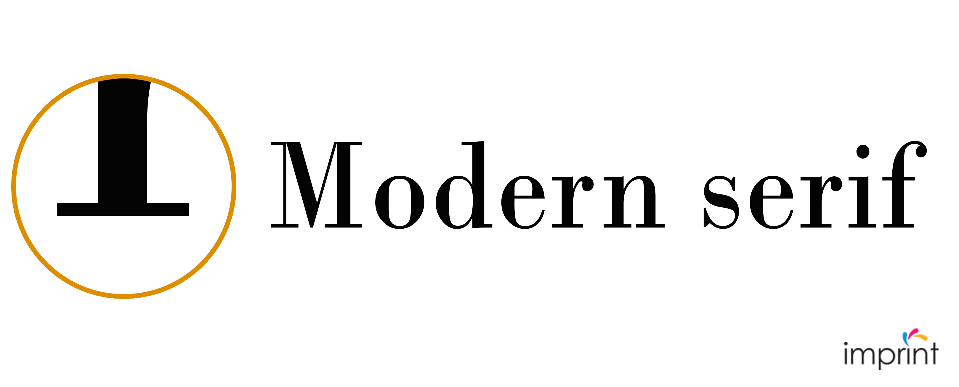
Presses got increasingly accurate as printing methods advanced in the late 18th and early 19th centuries. Better paper and ink allowed for greater details in the font styles. Let’s go over the specifics:
– Serifs are now fully straight and flat.
– The brackets either vanished or became quite tiny.
– The load is now totally vertical, and the contrast between thick and thin is intensified.
– The terminals were near, if not totally, spherical.
When compared to the cap height, the x-height is medium to tall.
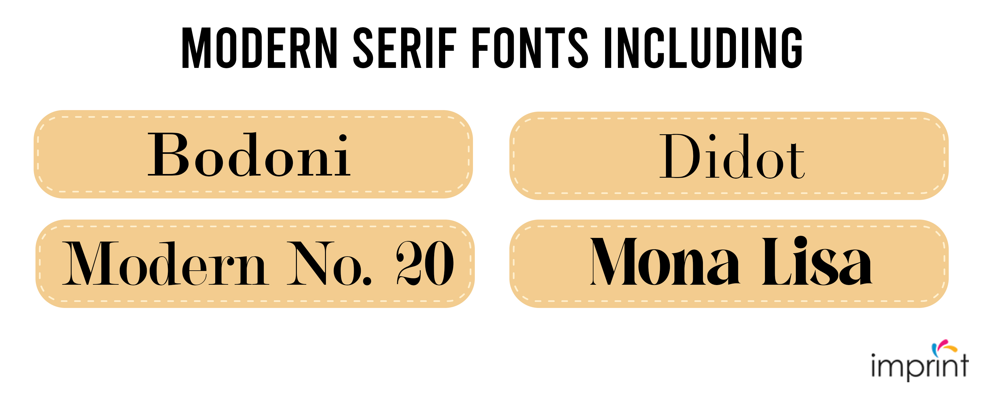
Modern Serif fonts include Bodoni, Didot, Modern No. 20, and Mona Lisa.
Slab Serifs
Due to its bulky appearance, Slab Serif fonts are the simplest to recognize. Slab Serif fonts stand out from the serif sub-category due to their distinct appearance. More ink coverage on paper was possible thanks to improved printing methods. This enabled the development of Slab Serif fonts as a display font for advertising. Consider the following characteristics:
– In comparison to the other classifications, the serif is square in shape.
– Serifs are thicker, heavier, and have little or no bracket link to the strokes.
– Serifs are frequently the same thickness as the strokes on the letterforms.
– The characters now have full vertical tension.
The x-height is typically relatively tall in comparison to the cap height.
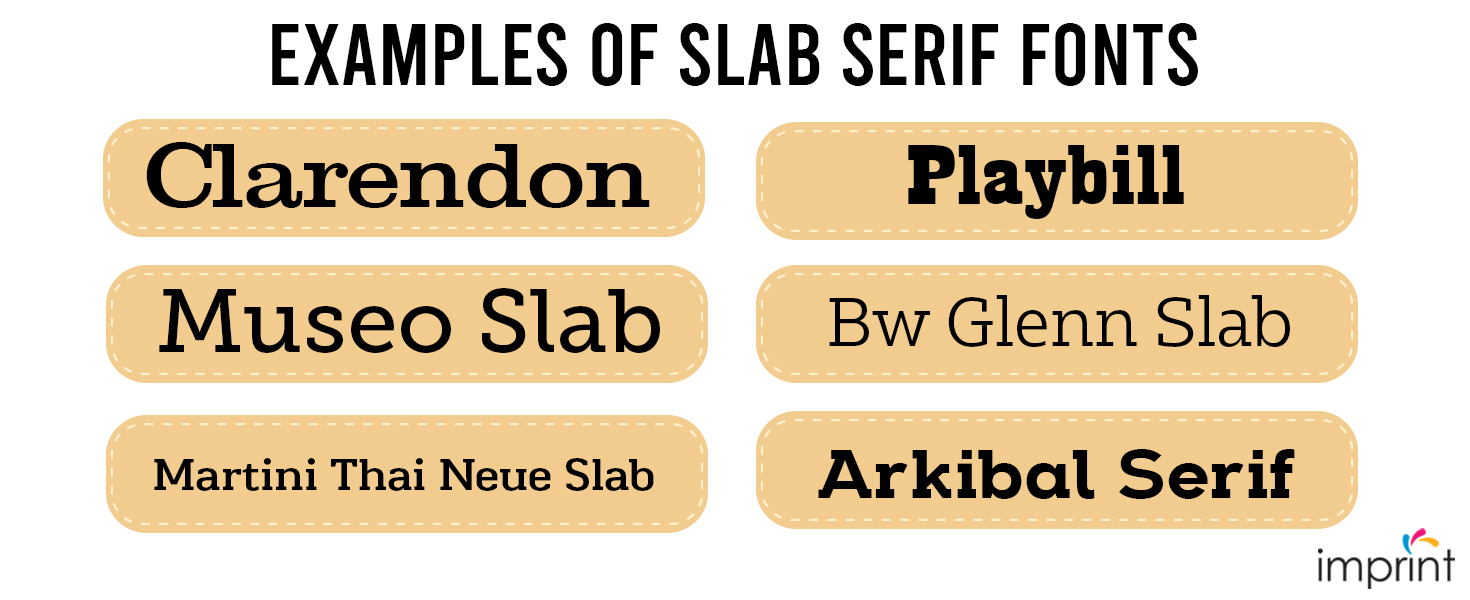
Clarendon, Playbill, Museo Slab, Bw Glenn Slab, Martini Thai Neue Slab, and Arkibal Serif are examples of Slab Serif fonts.
Sans Serif font
The term “sans” originates from the French word for “without,” and that is exactly what this category represents: serifless typefaces. Roman letters etched into marble and stone were found as both serifs and casual sans serifs.
Yes, Sans Serifs are not a recent innovation; in fact, the very earliest kind of sans serif was employed as inscriptions in the 5th century BC. William Caslon created the first Sans Serif printing type in the early 18th century, which only contained an uppercase version. Sans serif fonts eliminated all of the handwritten characteristics that serifs sought to replicate. Below are some popular sans serif fonts.
Grotesque sans serif fonts
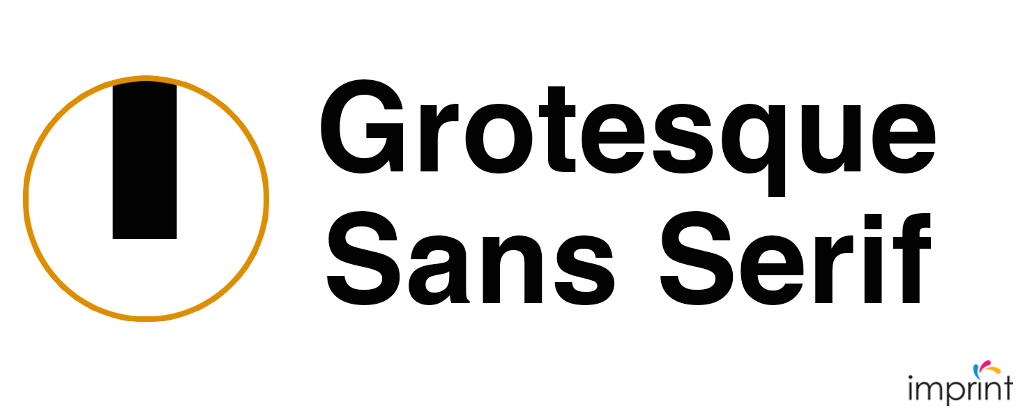
In the early 1900s, this was the first commercially popular Sans Serif design. In general, grotesque typeface designs were more erratic than the more streamlined Neo-Grotesque (Helvetica). As a result, grotesque typefaces were less polished and had more individuality and eccentricity. Some of the features are as follows:
– The uppercase “G” frequently has a spur. Except for the uppercase “M,” which is practically square-shaped, the uppercase letters are of the same width.
– There is little distinction between the thin and thick strokes.
– The cap-height and ascenders are normally at the same level.
– The ‘bowl and loop’ on the lowercase “g” is the most popular. The letter “g” also has a double-story, which comes from the serif category.
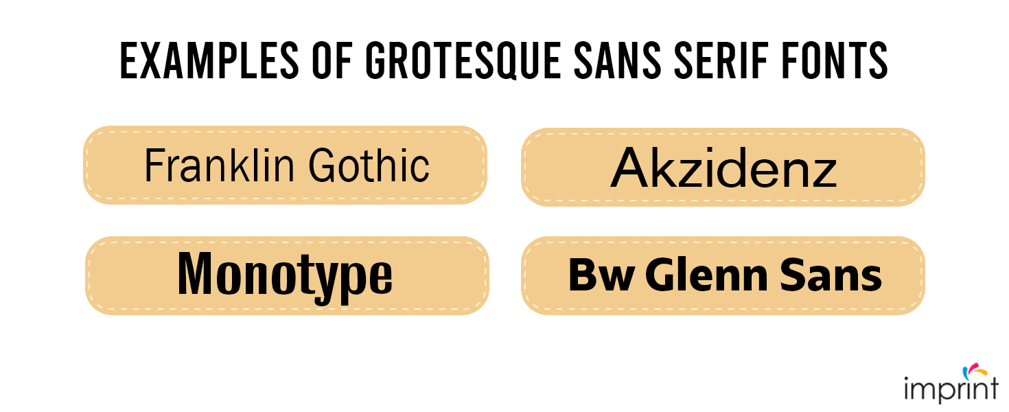
Franklin Gothic, Monotype Grotesque, Akzidenz Grotesque, and Bw Glenn Sans are examples of Grotesque sans serif fonts.
Neo-Grotesque sans serif fonts
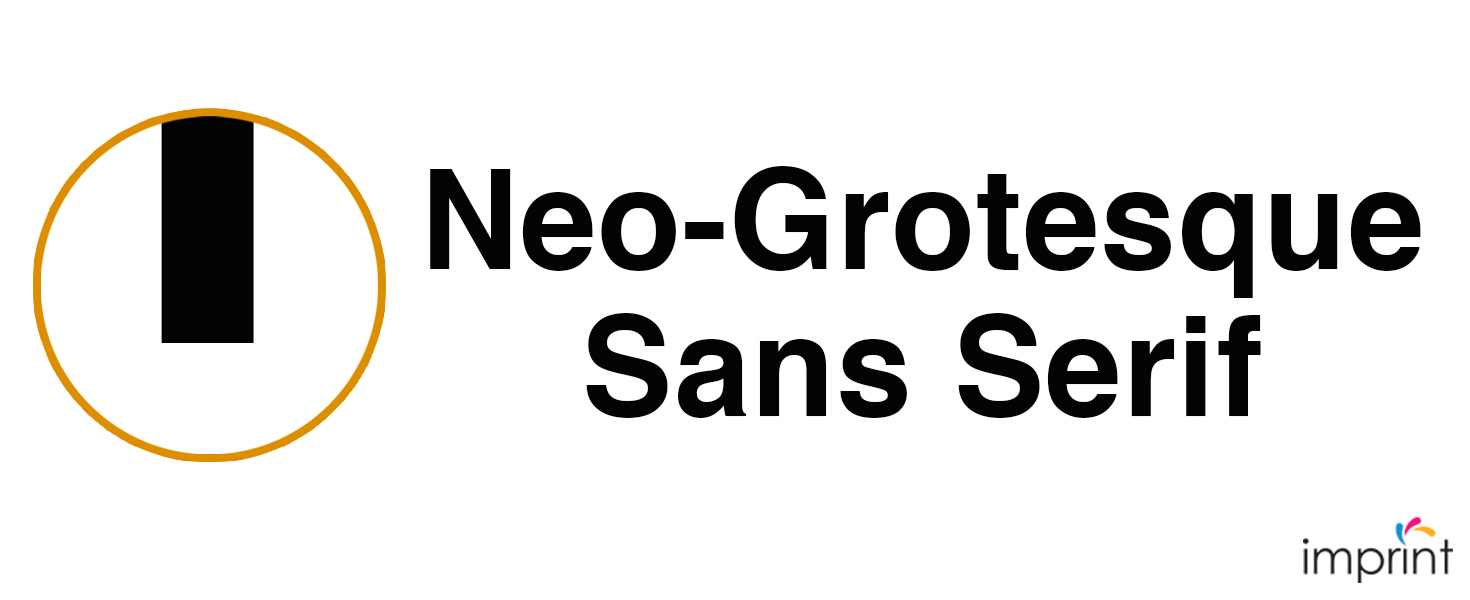
Neo-Grotesque font type evolved from grotesques in the late 1800s. The designers aimed toward intelligibility and neutrality. As a result, the font type’s personality was wiped away. Among the distinguishing features are:
– The conventional sans serif qualities are abandoned, and the letterforms become simpler, minimal, and neutral.
– The stroke is consistent across the letterform.
– The terminals are usually completely straight, giving them a geometric appearance.
– The aperture gap between the letters “e” and “a” was filled by Neo-Grotesque fonts.
– The single-story “g” is the most distinguishing element of Neo-Grotesque shapes.
Neue Haas Unica was designed in the 1980s, but it is an excellent example of the Neo-Grotesque style alongside the omnipresent Helvetica.
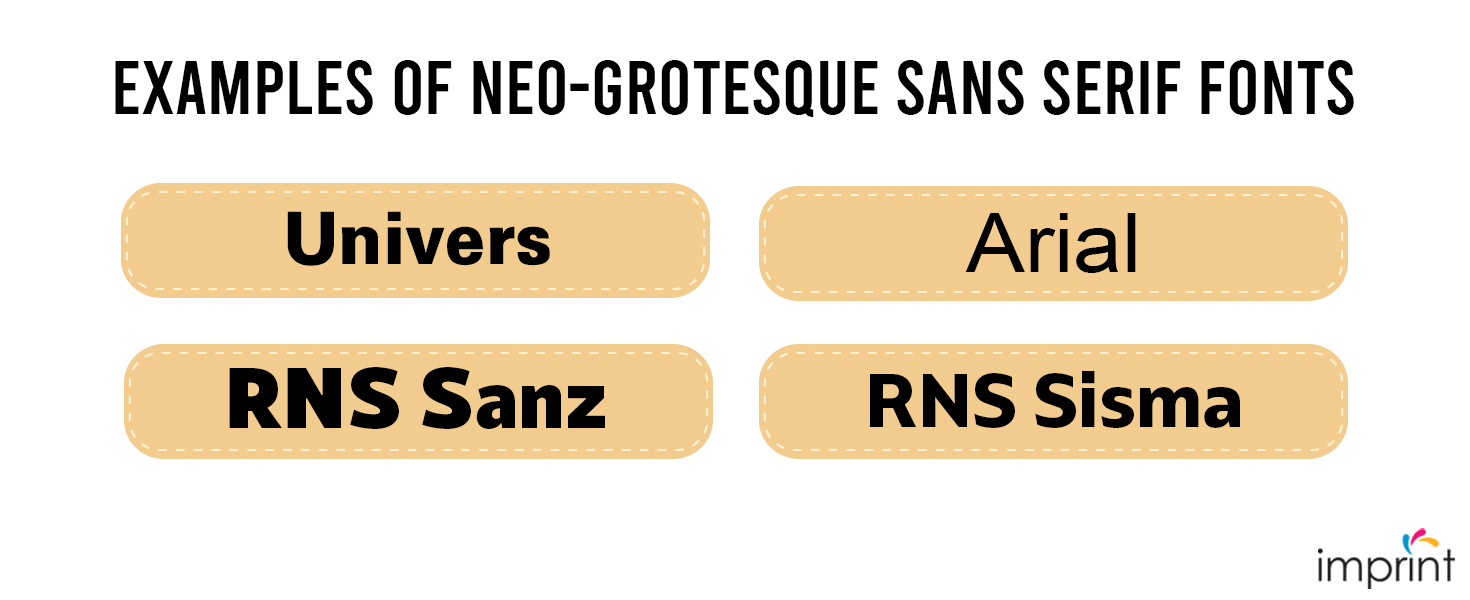
Univers, Arial, RNS Sanz, and RNS Sisma are examples of Neo-Grotesque fonts.
Geometric Sans serif fonts
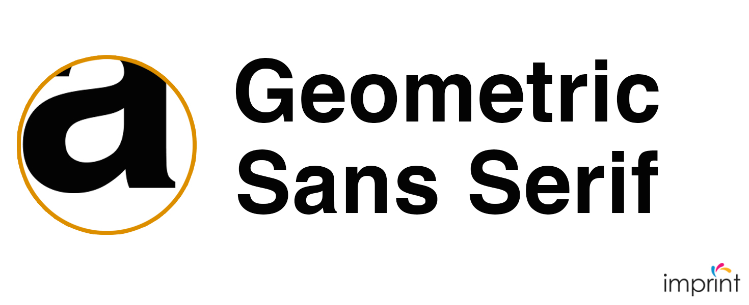
Geometric forms are the foundation of the Geometric style. The characters were meant to be legible, yet their structure had the opposite effect. This was a popular style in the 1920s that originated in Germany. They were famous as body copy because of their clean, modern look. Unfortunately, because of the strange rhythmic structures, long-form material does not read well in this style. The following are some of the key features:
– The bowls are optically round and have a constant stroke thickness.
– Straight lines are heavily emphasized. As a result, the stroke has a consistent thickness.
– A single-story lowercase “a” and “g” are featured in this category.
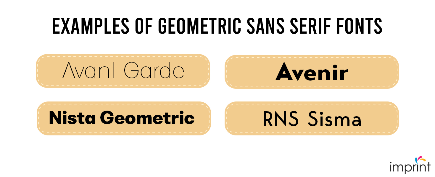
Avant Garde, Avenir, Nista Geometric, RNS Miles, and Bergen Sans are examples of Geometric fonts.
Humanist Sans serif fonts
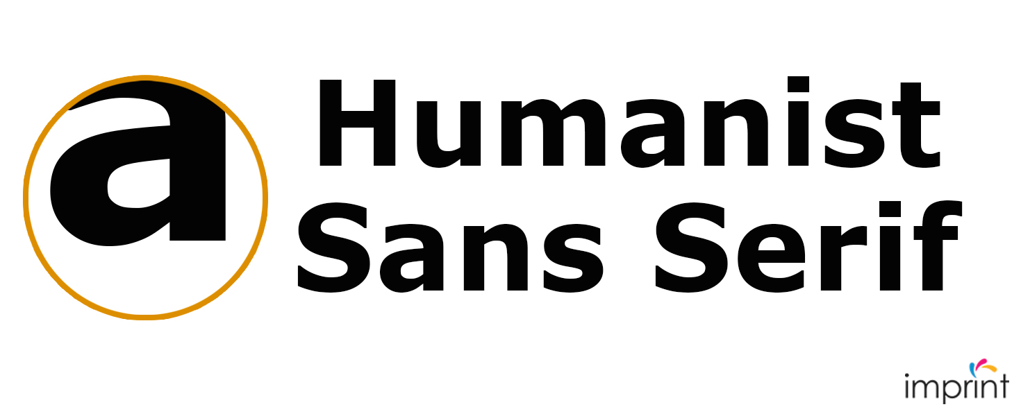
Humanist sans serif fonts were based on Roman capital proportions. Typographers wanted to give the letterforms a calligraphic feel. Let’s look at some specifics:
– Proportions are based on the Roman style.
– The difference between thick and thin strokes is more visible.
– Humanist Sans Serif fonts, like those in the Old Style group, may have minor stress on the vertical axis.
– The aperture on the letters “a” and “s” has been widened for better legibility.
– To replicate the old-style serif, the letter “g” incorporates a double-story “g.”
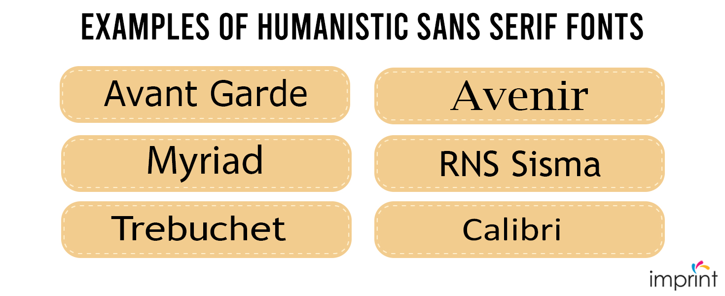
Verdana, Lucida Grande, Optima, Myriad, Trebuchet, and Calibri are examples of Humanistic styles fonts.
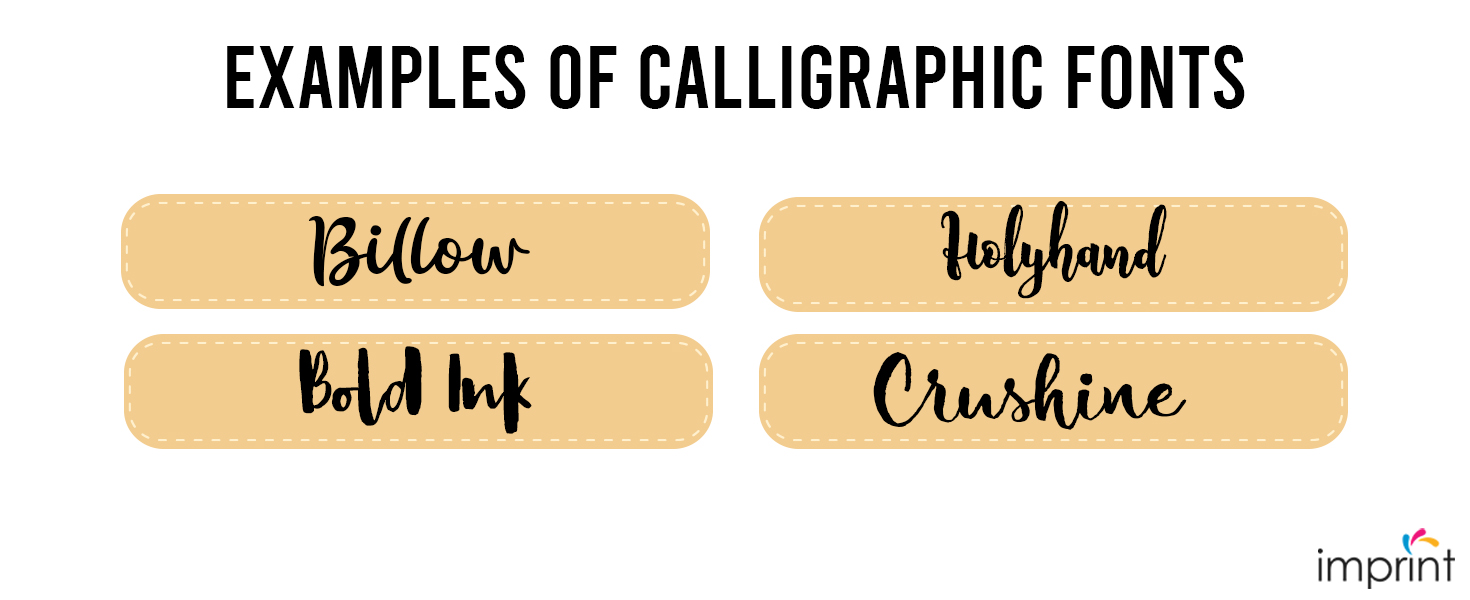
Calligraphic fonts
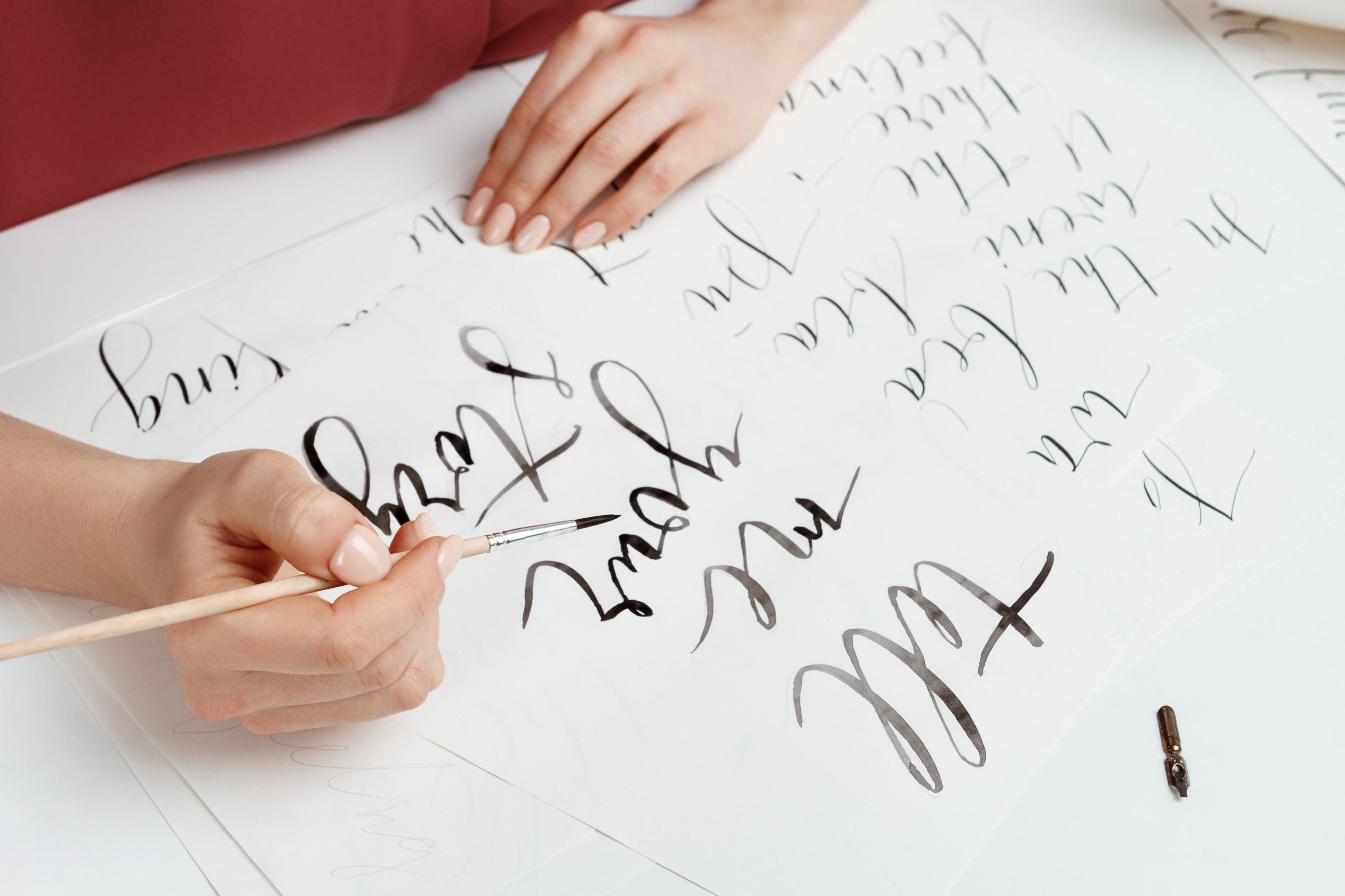
In recent years, Calligraphic Fonts have grown in popularity. The technological world has made us want the human touch in font design. Calligraphic fonts have a more contemporary feel than script fonts. Consider the following features:
While still attempting to imitate brush and nib strokes, the letterforms are fairly modern.
The contrast between thick and thin strokes gives the font texture.
Billow, Bold Ink, Holyhand, and Crushine are some examples of calligraphic fonts.
Script fonts

Script typefaces are classified into two categories based on the flow of cursive handwriting: formal and casual. Cursive and flowing letterforms are common in scripts.
These fonts should not be used for body copy since they can become quite unreadable. Use these fonts for display purposes, such as headlines, titles, or very brief prose. Take a look at the following:
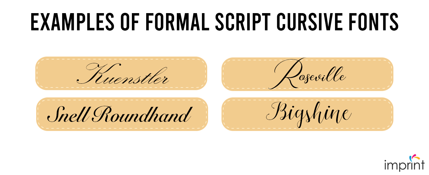
Formal scripts Fonts
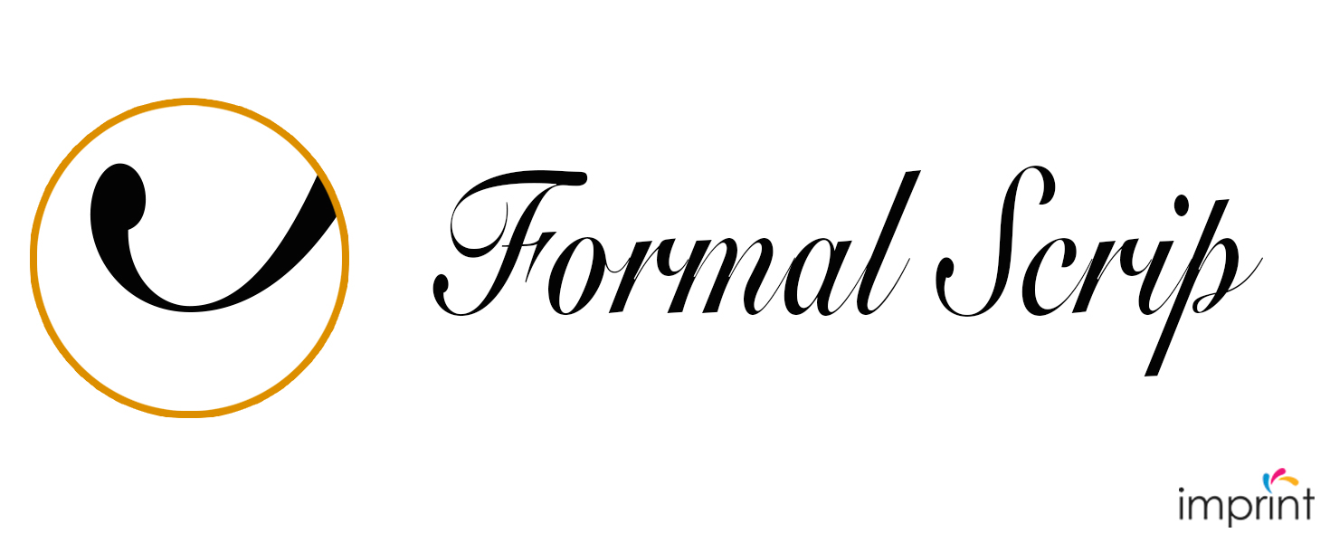
Formal scripts, as the name suggests, are the most opulent. Wedding invitations and diplomas include these gorgeous typefaces. Some of the most important traits are:
– Cursive scripts are inspired by handwriting from the 17th and 18th centuries.
– For smoothness, each character has a connected terminal tail.
– Cursive typefaces use flourishes and swashes to decorate the characters.
– In historical-themed publications, wedding invites, or romantic book covers, use formal script typefaces.
Kuenstler, Snell Roundhand, Roseville, and Bigshine Script are examples of Formal Script cursive font.
Casual script fonts
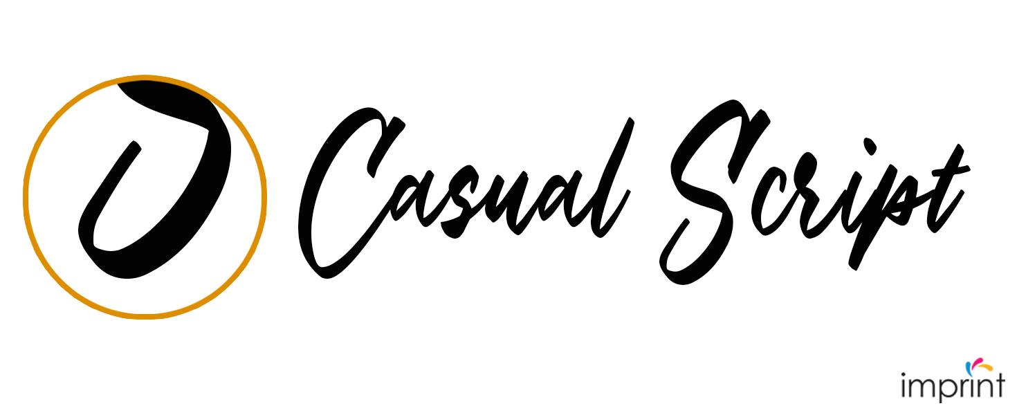
Wet brush strokes inspired the development of casual script in the 20th century. The letterforms do not always have to be related, but they are occasionally. Let’s look at some specifics:
– Casual scripts seem like a wet brush strokes or pen drawings.
– In comparison to formal scripts, they are more easygoing and pleasant.
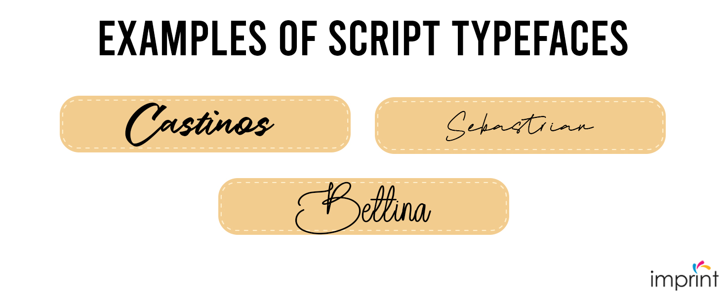
Castinos, Sebastrian, and Bettina Script are examples of Script typefaces.
Handwriting
These types of fonts are relatively new—only a few years ago, they were difficult to find. We’ve seen a boom in the number of available typefaces, and we can now find them in almost any place. These typefaces are great for display types, such as headlines, book covers, or logo design, because they may provoke extremely distinct moods. Let’s go over the essentials:
– Handwritten fonts lack the structure and clarity that fonts in the Script category have.
– Handwritten fonts are far more casual, laid back, and attempt to emulate modern-day handwriting.
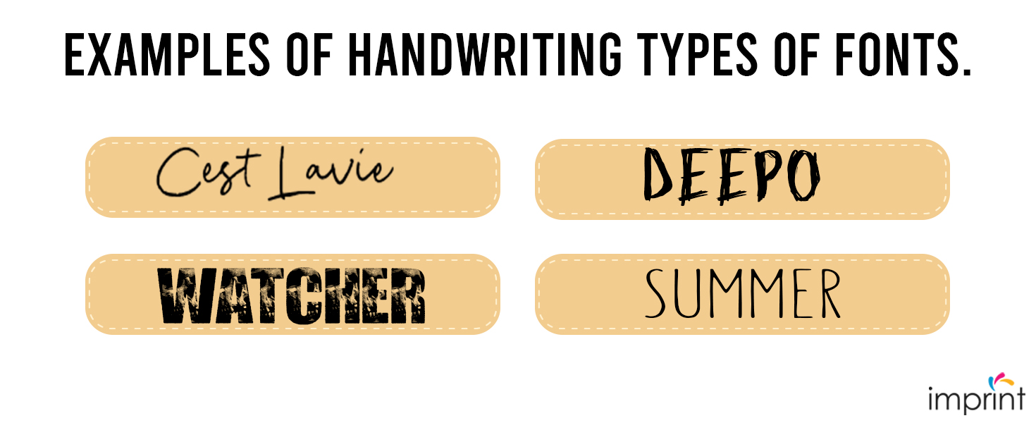
Cest Lavie, Watcher, Deepo, and Summer are some examples of handwriting types of fonts.
Display/Decorative fonts
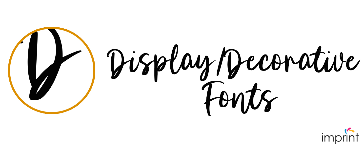
The Display/Decorative font category is the most extensive and diverse. The fundamental disadvantage of these typefaces is that they are unsuitable for body copy since they become illegible. Letterforms are frequently experimental or disturbed.
This category includes a variety of tattoo fonts, graffiti-style fonts, and many others. These typefaces are best suited for headlines, logos, very short copy, and emphasis. The majority of these typefaces are designed with a specific purpose in mind.
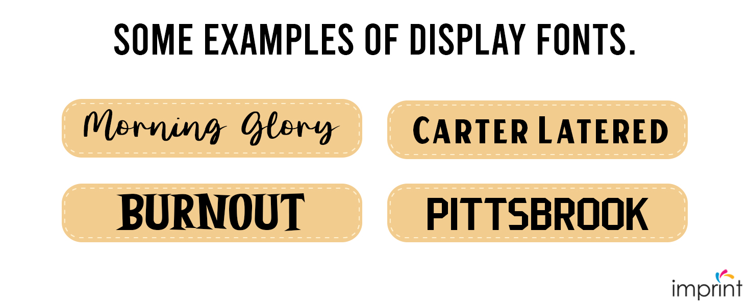
Morning Glory, Burnout, Carter Layered, and Pittsbrook are some examples of Display fonts.
Blackletter fonts
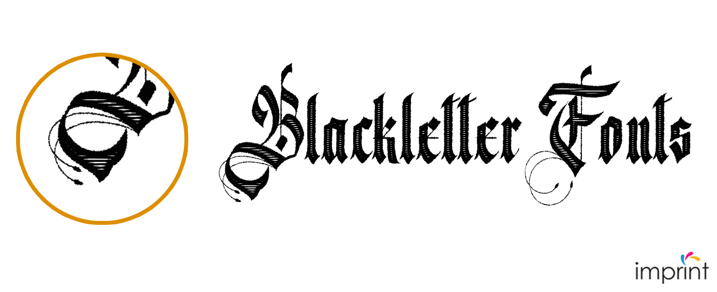
Blackletter, often known as Gothic, originated in the 1400s and is based on medieval calligraphy. Illuminated manuscripts inspired this style.
Blackletter is classified as a script typeface in several type categorization schemes. Blackletter was the typeface style used for the Gutenberg 42-line Bible, the first book ever printed in moveable type. It was mostly utilized in Germany. The extremely decorative capitals are the distinguishing feature of this type. A page created using the Blackletter typeface can be dense and textured.
The following are some of the key features:
– Blackletter typefaces were created by drawing horizontal, vertical, and angled strokes with a flat nib held at an angle.
– The letterforms are stressed vertically.
– The thick and thin strokes have a significant contrast due to the nib pen.
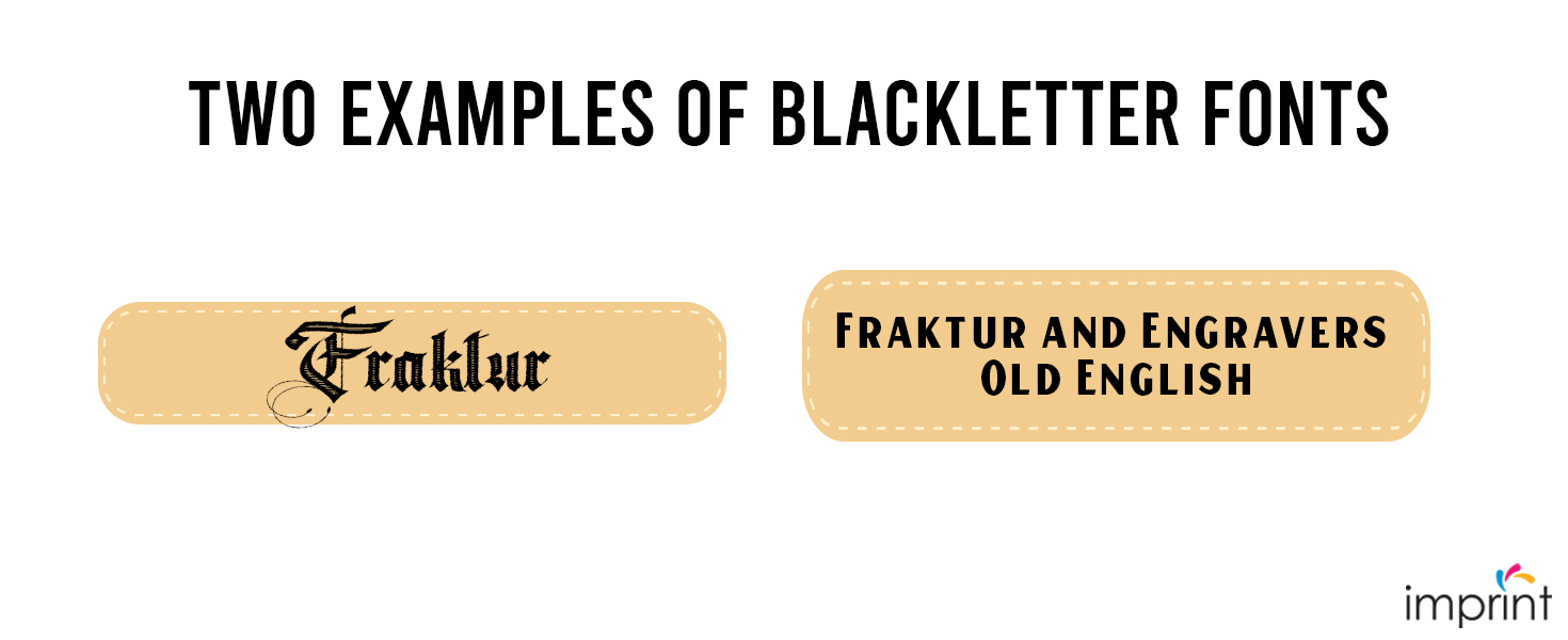
Fraktur and Engravers Old English are two examples of Blackletter fonts.
How to Choose the Right Typeface
Fonts can generate diverse emotions depending on their form or the era they were influenced by. Depending on the job, you’ll want to portray and transmit emotion through design. Let’s look at what some of these categories mean:
Serif fonts
Are frequently considered formal and can convey an older vibe. Serifs are appropriate for long-form writing such as novels, blogs, and periodicals. The serifs make it easier for the reader’s eyes to follow the letterforms.
Sans Serif Typefaces
Is one of the most adaptable font families. They can be used for display or long-form copy. These letterforms are clean, basic, and contemporary. Some fonts in this category may be neutral, while others may have a hint of personality that will bring sparkle to your design.
Calligraphic and Handwriting Font Family
This is the typeface for your project if you want to convey a personal sense. This font is mostly informal and comes in a variety of styles. Be cautious while selecting one for your project because the style can provide a certain vibe that can range from charming to rough.
Script Fonts
Whether you select a formal or informal script font, you will undoubtedly convey an old-world vibe. These fonts are appropriate for historical pieces, wedding invitations, and book covers.
Display/Decorative Fonts
These typefaces are typically created with a single goal in mind: to draw attention. Use caution when using these fonts at small sizes, as some ornamentation can make them difficult to read.
Blackletter Fonts
This gothic-inspired category is ideal if you want a somber and dark typeface. As long-form texts, they can be attractive, weighty, and difficult to read. This style is appropriate for headlines and displays copy.
Conclusion
A crucial part of any design piece or brand identity is selecting the right font. The ideal font can help you more effectively communicate your company’s ideals and objectives by adding new levels of symbolism to your brand.
Make sure to take into account how each font style and type matches your brand’s image. You may tell the tale of your business by choosing the correct combination of fonts and design components.
Contact Us Today!
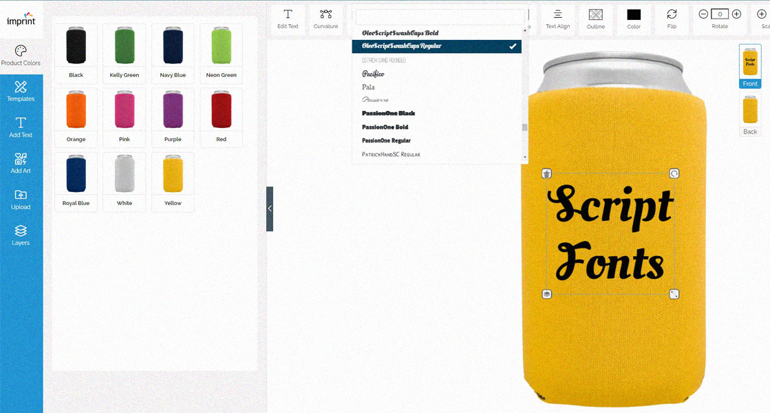
The majority of the discussed typefaces are available for use on Imprint.Com‘s Design Studio platform. You can browse through the large selection of fonts we offer to personalize the product of your choice, ranging from apparel, drinkware, signs, bags, wedding & party items, etc. You can shop using our pre-designed templates or create your own design and we will do the rest!
Contact us today for friendly and expert support.
Sources:
Miller, Carly. “The Different Types of Fonts, and When to Use Them.” The Different Types of Fonts, and When to Use Them | Tailor Brands, www.tailorbrands.com/blog/types-of-fonts. Accessed 26 Apr. 2023.
Studio, Letterhend, et al. “Free Fonts: 100,000+ Font Downloads.” Fontspace, www.fontspace.com/.
ByFontesk. “Free Fonts & Typefaces ‘ Fontesk.” Fontesk, fontesk.com/.