Last week we made a list of the best-designed 2016 campaign logos on the Democratic side. You can find that list here.
Today, it’s time to rank the 2016 presidential campaign logos on the Republican side! Since there are so many presidential candidate logos, we’re only going to look at the top 10 Republican candidates in the polls at the moment.
10. Mike Huckabee
This is horrendous. It’s overly complicated, and those stars are straight out of a children’s book.

9. Donald Trump
Trump’s campaign logo is simpler than Huckabee’s, but it still takes the spot for the second ugliest campaign logo. In 2016, it’s usually a bad idea to choose a font like arial black, impact, etc. unless you’re designing the poster for a crime drama. There’s also nothing that distinguishes this from other candidates, but Mr. Trump does a good job of doing that himself.

8. Ben Carson
This is one of those logos that isn’t really a logo at all, but just a long campaign title. Not having an actual logo is a bad idea, since they help brand a candidate and make them more memorable. There are too many colors here to easily read and digest the information, and the typography is a bit off (the space between Ben and Carson seems too large).

7. Chris Christie
Another logo that isn’t much of a logo at all. Still, it’s a better design than Ben’s, as it’s easier to read and better spaced.

6. Ted Cruz
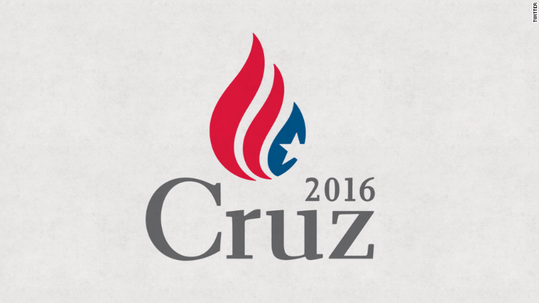
We’re getting into the “okay” logos now. Not bad in terms of design, but not great either. This logo from Ted Cruz is nice and unique and features a logo representing the American flag. However, the serifs in this font make him look outdated as a candidate. Plus, some people have compared the flame to soft serve ice cream.

5. John Kasich
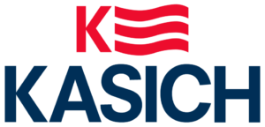
Not a bad logo, but the K-flag thing is kind of weird. It’s weighted pretty heavily to the right and looks like bacon.

4. Marco Rubio
The font choice is modern and approachable and the color palette is nice. However, the typography is still a bit weird (the spacing seems inconsistent between letters) and that tiny America is a bad call because of it’s size restriction.

3. Jeb Bush
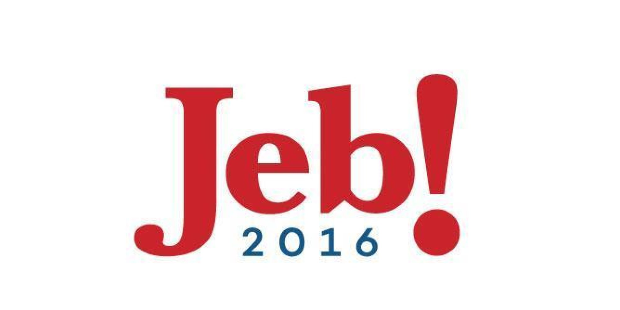
Breaking into the top 3, we’re seeing some very nice logos. The font for his first name is somewhat traditional with a serif, but the placement and exclamation point mark makes it approachable and fun. Most of the campagin logo is one color, which allows for simplicity even though the logo is quite distinctive. Our only complaint about the Jeb Bush logo is that the exclamation mark seems a bit forced.

2. Rand Paul
Some criticize Rand Paul’s logo for not looking political enough (people say it looks like an energy company), and we agree with that sentiment, but it’s still a great looking logo. It uses the same flame cliche that Cruz does, but in this case it works with the typography like a match made in heaven. Do you see the little torch logo made out of the negative space?

1. Carly Fiorina
And at number one, our favorite logo in the Republican race, is Carly Fiorina’s. Some don’t like this logo for practical reasons. The thin typography and small star might make this difficult to print on smaller items, but for posters and t-shirts, this logo rocks. It’s modern, perfectly spaced, and very distinctive.


One thought on “2016 Campaign Logos For Presidential Candidates”